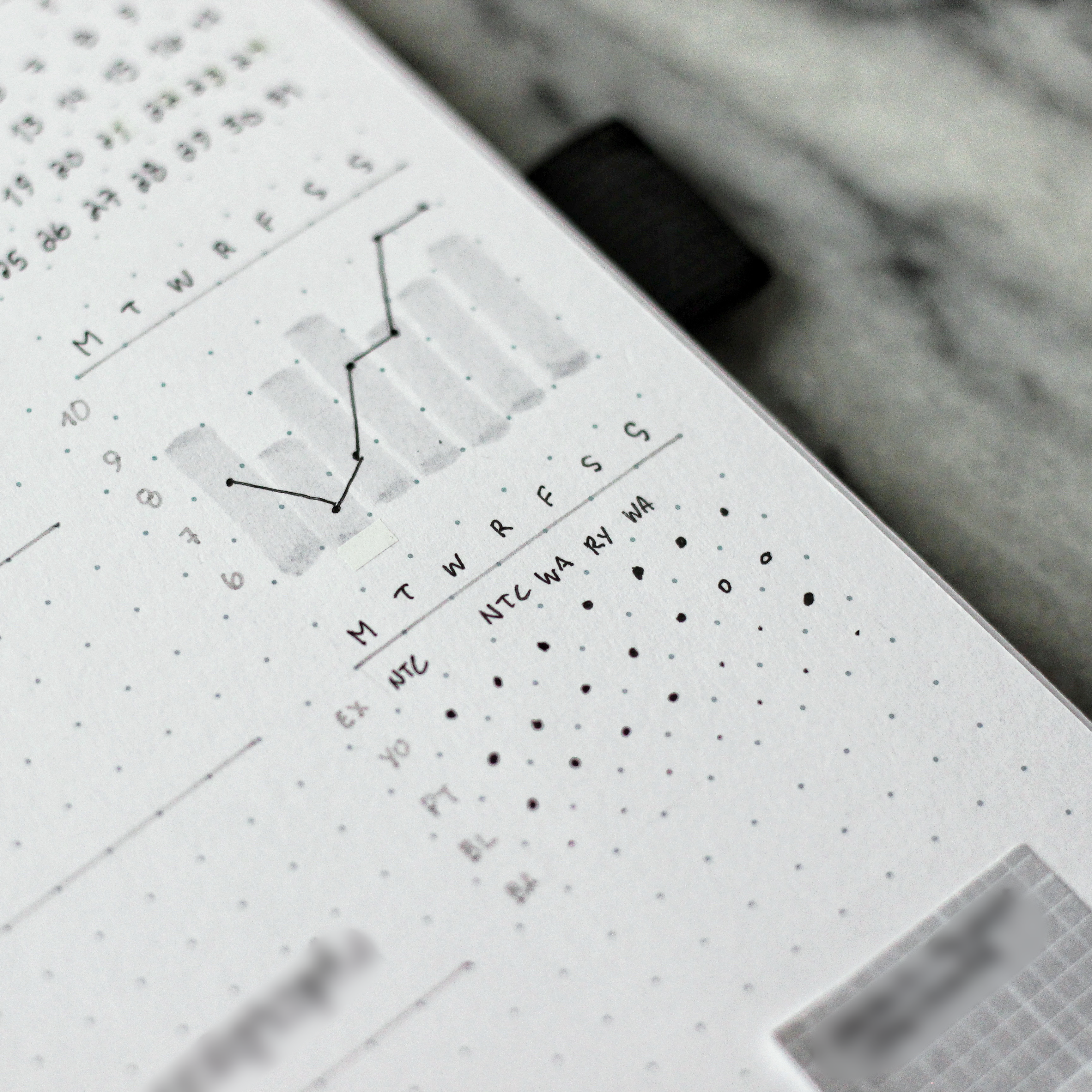
One of my most frequently asked questions is about my bar graph tracker in my bullet journal, so it’s high time I wrote up a little post about how it works!

That bar graph is my sleep and mood tracker.
It’s actually super simple—especially if you remember your graphing basics from school!
- X-axis (Horizontal) – days of the week
- Y-axis (Vertical) – numbered 10-6, descending
The bars represent how long I’ve slept that day: from 10 hours down to 6 hours (I usually don’t sleep too much less than that, phew!) on the Y-axis.
The dots represent my mood that day. A higher dot (up towards the 10) means I was in a great mood. A lower dot means, you guessed it, a worse mood (towards the 6).

Above is an almost completely filled out example—I clearly did not sleep well on Saturday night (tiny tiny bar) BUT it was apparently a great day because my mood was at the top!
Meanwhile that Tuesday, I slept well but my mood was on the lower end.
I always have this “tiny tracker” module on my weekly spread. I also have a longer one on my monthly spread as well that includes all the days of the month in one visual.
Customization Ideas
You could easily customize this tracker with a different number of hours for sleep (you may need to make the vertical axis longer).
You could also track a mood more specifically. Perhaps you color code the dot to represent a different mood and the level it’s at (low to high) is an intensity, rather than just being generally a good or bad mood.
What do you think? Would you give this tracker a try? Let me know in the comments below!
For more resources from me, check out my Journal Prompt Packs—30 days of cozy journaling prompt ideas.

Leave a Reply