It’s time to look back at February! This is part of a series where I look back at the spreads for a month and reflect on why I made the adjustments I did and reflect on what’s working and what wasn’t. We’re talking functionality and we’re talking design, so grab your bujo and let’s get inspired!
Week 5


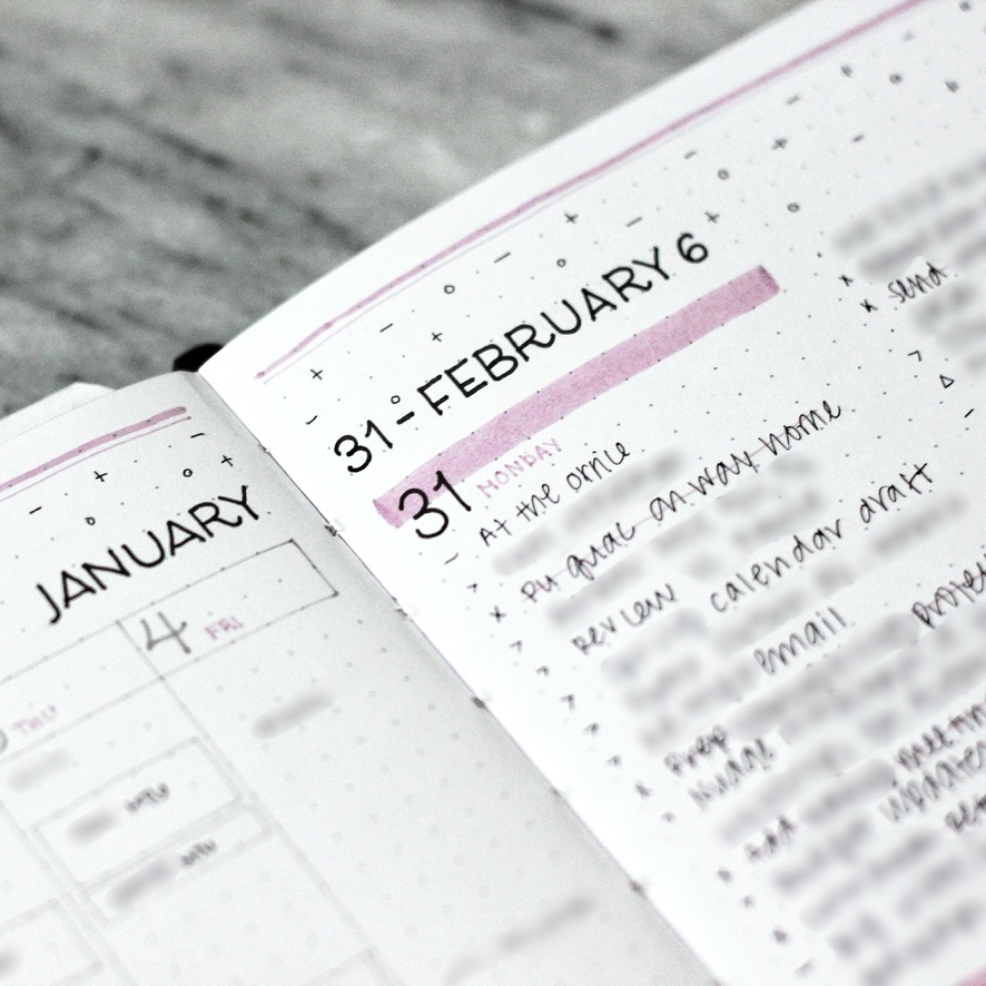
It begins… I’m sounding foreboding on purpose because this was when I started to really experiment with my spreads this year and I found my new favorite setup! But let’s start with this origin spread, shall we?
Graphically I was loving the plus-minus-dot idea I had started the week before, and decided to use one of my favorite . This is also a new font for a new month, so the plus-minus-dot decoration carried the look of the pages forward nicely even though the font was super different!
Functionally, I got the idea to experiment with daily logs again. As you may know if you’ve followed me for a while, I looove a weekly task list but I was also craving a way to log more of my day, feelings, and notes along the way. Also, I’ve been working with Bullet Journal this year (yes: THE official Bullet Journal! ps. affiliate link) and wanted to try to get back to basics!
Long story short, I really loved the daily logs but—if you slide the image above to flip the pages—you’ll see I only used two total pages, just one spread. This seemed such a waste and I had this extra page in the set of weeks, so I did something different the week following…
Week 6


And here we go: A faux Dutch Door! Slide the image above to check it out. A traditional Dutch Door spread is when you cut out the middle page of your spread to see more things at a glance, kind of giving you an extra page in the middle of your spread. Personally I always get nervous about cutting pages in my bullet journal so I’ve only tried them a few times. While I love the look of them, I also don’t like using them too much because they mess with the bulkiness of your bujo when you close it up (since you’ve cut out some of the pages) and can make it hard to write on if you do a lot of them since then the pages behind aren’t flat anymore.
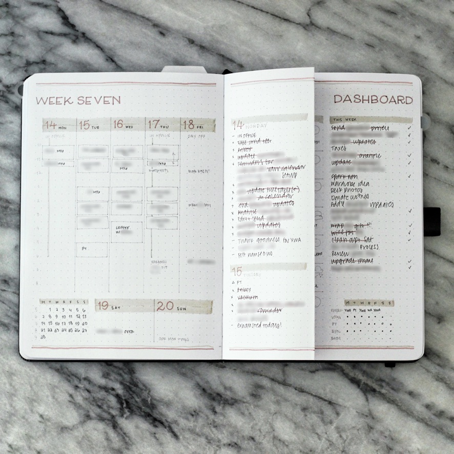
Enter: The faux Dutch Door! I can’t believe I hadn’t tried this before. You just fold a page in half and then you can write on both sides of the pages. As you work through the week you just flip the folded page over or around. I put my daily logs on these and the amount of space is absolutely perfect. Plus I have room for a weekly dashboard (rather than having to make a full spread) and my timetable, and my beloved weekly task list for things that I want to remember to do at some point but that don’t need to be done right away. I can keep that visible with the folded daily logs, so if I have a free moment to tackle something, it’s easy to do!
Graphically, I switched to blue and yellow Mildliners and kept it minimal—just a few starry/moon doodles!
Week 7


I fell totally in love with the faux Dutch Door and kept it up here! This time graphically I went with an unusual color combo for me: browns and tans! I usually go for cooler tones, but I think I’ve been inspired by cozy gamer TikToks and MaisyLeigh’s beautiful, cozy neutral setups, all of which tend to warmer color palettes.
Week 8

Speaking of warmer color palettes, I stuck with tan and added in some springy green accents inspired by these MU Print-on Stickers from Yoseka Stationery! I love the MU stickers because you burnish them on and they are flush with the paper, not sticking up at all. It looks like you printed them or drew them yourself. I had so much fun with this one collaging patterns all over and I think this set looks especially good with the lettering style I was inspired by!
What did you think of February’s spreads? Do you think you’ll try a faux Dutch Door? I have a tutorial coming up soon for how to make this super easy style of spread, so stay tuned!
Supply Highlights
NOTEBOOK
Archer & Olive A5 Dot Grid notebook (gifted, use code LINEUNFOLDING10 for 10% off)MARKERS
Archer & Olive Calliographs (gifted, use code LINEUNFOLDING10 for 10% off), Sailor Shikiori Brush PensPENS
Pilot Juice Up 03 (black)
Uni Pin Pen 01 (black, dark grey, light grey)STICKERS
Note: Some of the links above and in this blog post are affiliate or commissionable links. This means that if you click on them and make any purchase through my link, I get a small kickback at no cost to you. This greatly supports me in creating content, so thank you so much if you choose to shop through my links!
MU Print-on Stickers #138 from Yoseka Stationery

Leave a Reply