One of my favorite things about my bullet journal is that I can change it up from week to week—whether that’s adding doodles or simplifying, or just tweaking tiny parts of different modules to make spreads as usable as possible. This is a new series where I look back at the spreads for a month and reflect on why I made the adjustments I did and reflect on what’s working and what wasn’t. If you’re interested in digging deep into design choices that can support productivity, read on!
Week 1

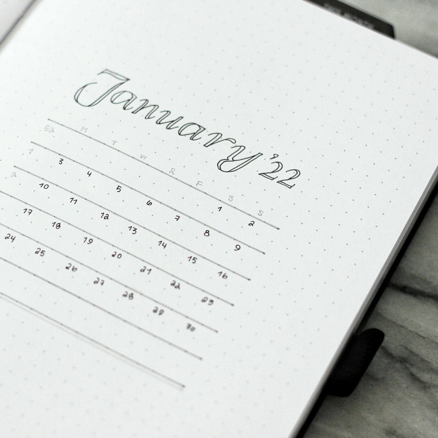
For the first week, I went super minimal to match my January spreads! Since I was making so many, I wanted the spreads to be simple and easy to recreate, but feel polished, thanks to the serif font I chose.
This one is a classic layout for me: I love a timetable to help me timeblock and visualize my week (I’m a visual learner, what can I say!), plus of course a #tinycalendar.
On the right, my tried-and-true running weekly task list! I adapted my method from Elizabeth at Plant Based Bride—she has a great tutorial at that link if you’re interested in trying it yourself! I customize it by putting the days of the week on the left and X-ing out the task on the day I complete it. The circles indicate a due date or the day I hoped to finish a project.
Last year, I had all my weekly trackers on this spread too, but since I have a dashboard now, I had much more space for a very long task list.
Week 2

I went with the same layout here because it was working so well! Functionally, the layout is the same with the timetable on the left and running weekly task list on the right.
Graphically, I wasn’t bored yet of the simple grayscale style with a sophisticated looking serif font, so I kept it here!
Week 3

By this week I was a little bored of the simple style (I definitely oscillate back and forth lately!), and wanted to jazz it up a little! It was freezing cold out if I remember correctly, so I was inspired by Sarica Studio’s Cozy Winter Stickers which I used all over this spread. I decided to stay with the same font I’d been using, but in different weights and styles—something a little bolder, and italics—and also wrote the headers in a lovely blue color from the Archer & Olive Calliographs line. They’re my absolute most favorite dual brush pen!
But of course as you can see, functionally it’s the same with the timetable + running task list combo! One of my bujo mottos: If it ain’t broke, don’t fix it!
Week 4

Here’s where I started to mesh the two! I was a little exhausted this weekend and didn’t want to make an artistic spread, so I went with simple decoration in the form of plus signs, minus signs, and dots.
Since I was keeping the same layout, I wanted to switch up the lettering styles a little bit. I’d decided by this point I wanted to theme my monthly spreads by fonts (as in, one font a month! That’s honestly about as much of a theme as I can commit to!)—so I kept my beloved polished serif and used the blue Calliographs from the previous spread to tie it all together. I loved how the italic serif looked in the date and task header in that delicate light blue.
Did you get inspired by any of these spreads? Stay tuned for next month’s spread walkthrough too where things definitely start to get… different!
Supply Highlights
NOTEBOOK
Archer & Olive A5 Dot Grid notebook (gifted, use code LINEUNFOLDING10 for 10% off)MARKERS
Archer & Olive Calliographs (gifted, use code LINEUNFOLDING10 for 10% off)PENS
Pilot Juice Up 03 (black)
Uni Pin Pen 01 (black, dark grey, light grey)STICKERS
Note: Some of the links above and in this blog post are affiliate or commissionable links. This means that if you click on them and make any purchase through my link, I get a small kickback at no cost to you. This greatly supports me in creating content, so thank you so much if you choose to shop through my links!
Sarica Studio Cozy Winter Stickers
Leave a Reply